Hello, I’m Roberto Perez
I solve real business problems by crafting laser-focused experiences. The iterative journey of quantitative and qualitative research and design enables me to confidently connect people with exceptional user experiences.
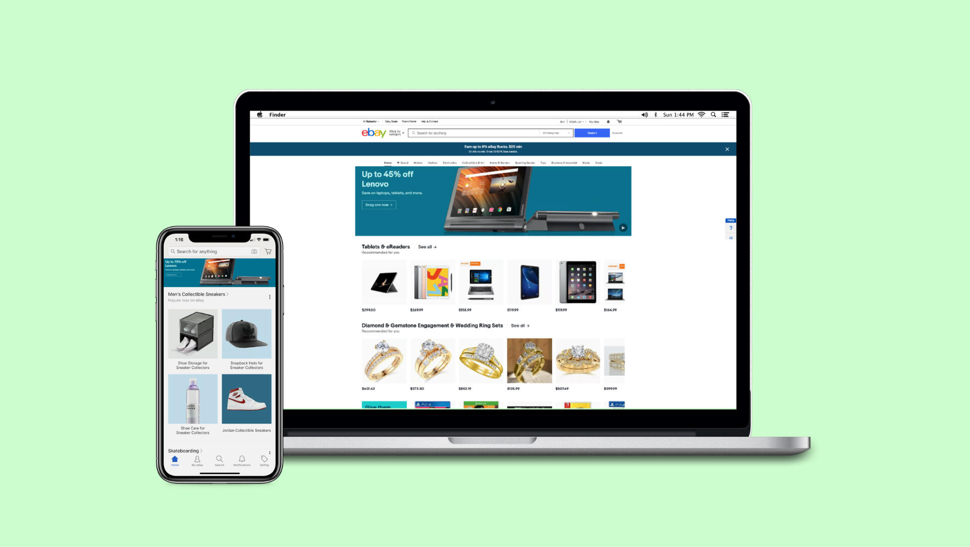
eBay Ads
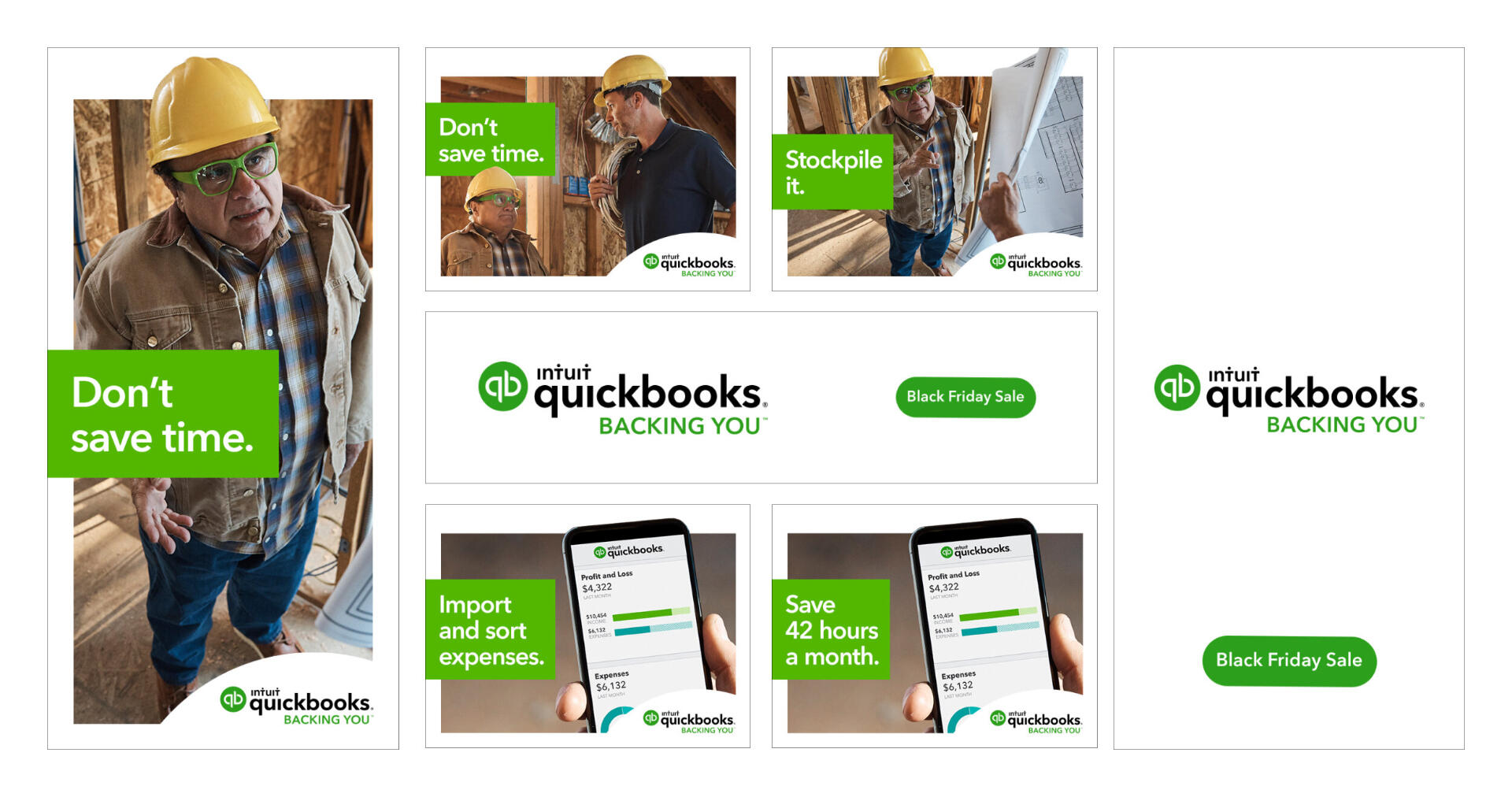
Personalize our target audience and offer brands cost-effective promotion for products and services.
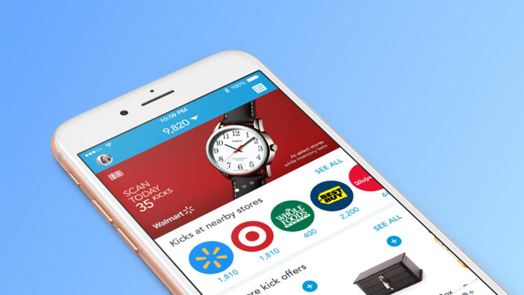
Shopkick
Promote users to earn rewards and discounts for in-store and online shopping.
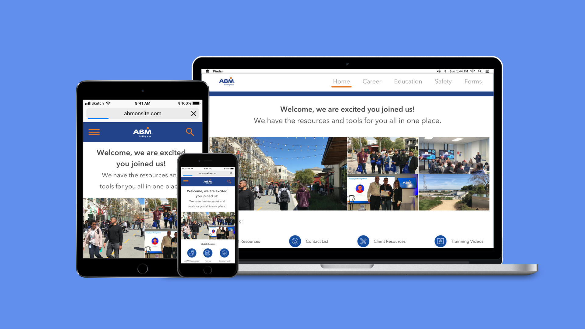
ABM Industries
Create an Internal tool to make Facebook campuses safe, efficient, and sustainable.
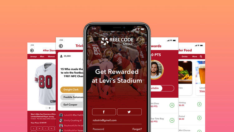
Reel Code Media
Design and implement an immersive digital experience at Santa Clara's Levi's Stadium.
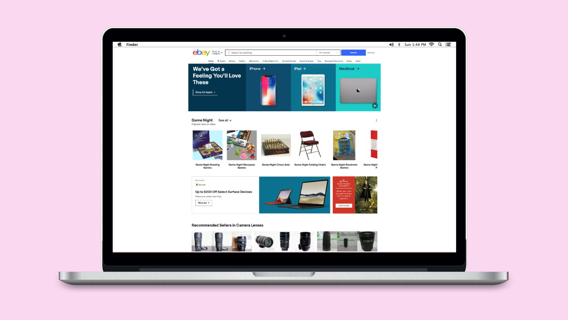
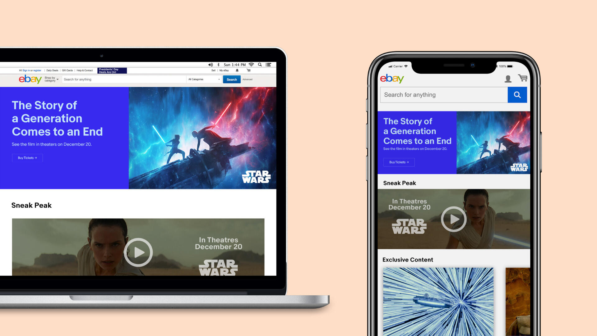
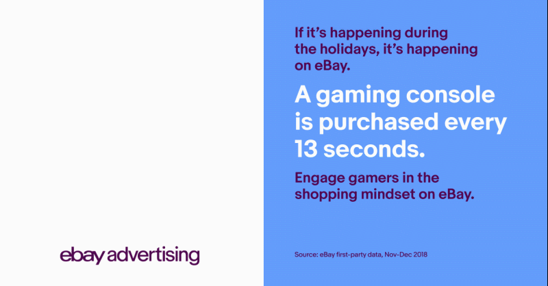
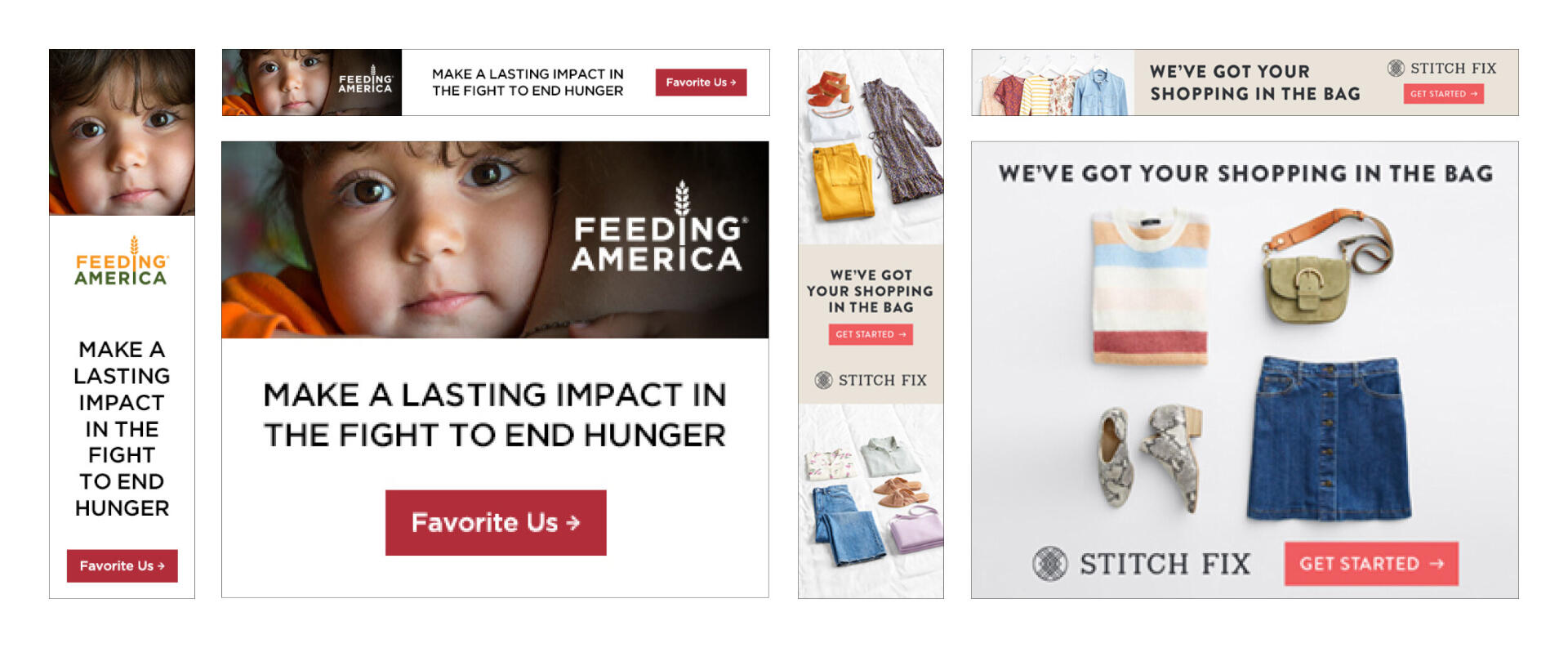
ContexteBay is an inspired marketplace that fuels passion and celebrates individuality as users shop, sell, and discover their perfect version. It’s what makes us Uniquely eBay. We create, refine, and innovate user experiences across multiple platforms. We believe in designing intentional, useful, and elegant products that we're proud of and our customers love.Major Tasks & ResponsibilitiesCreate in-app campaigns featured at eBay.com for top-tier brands and Service partners.Design Tools UsedPhotoshop, Illustrator, Sketch, & InDesign
High-Fidelity Prototype
Branded Landing Pages
Monthly Newsletters
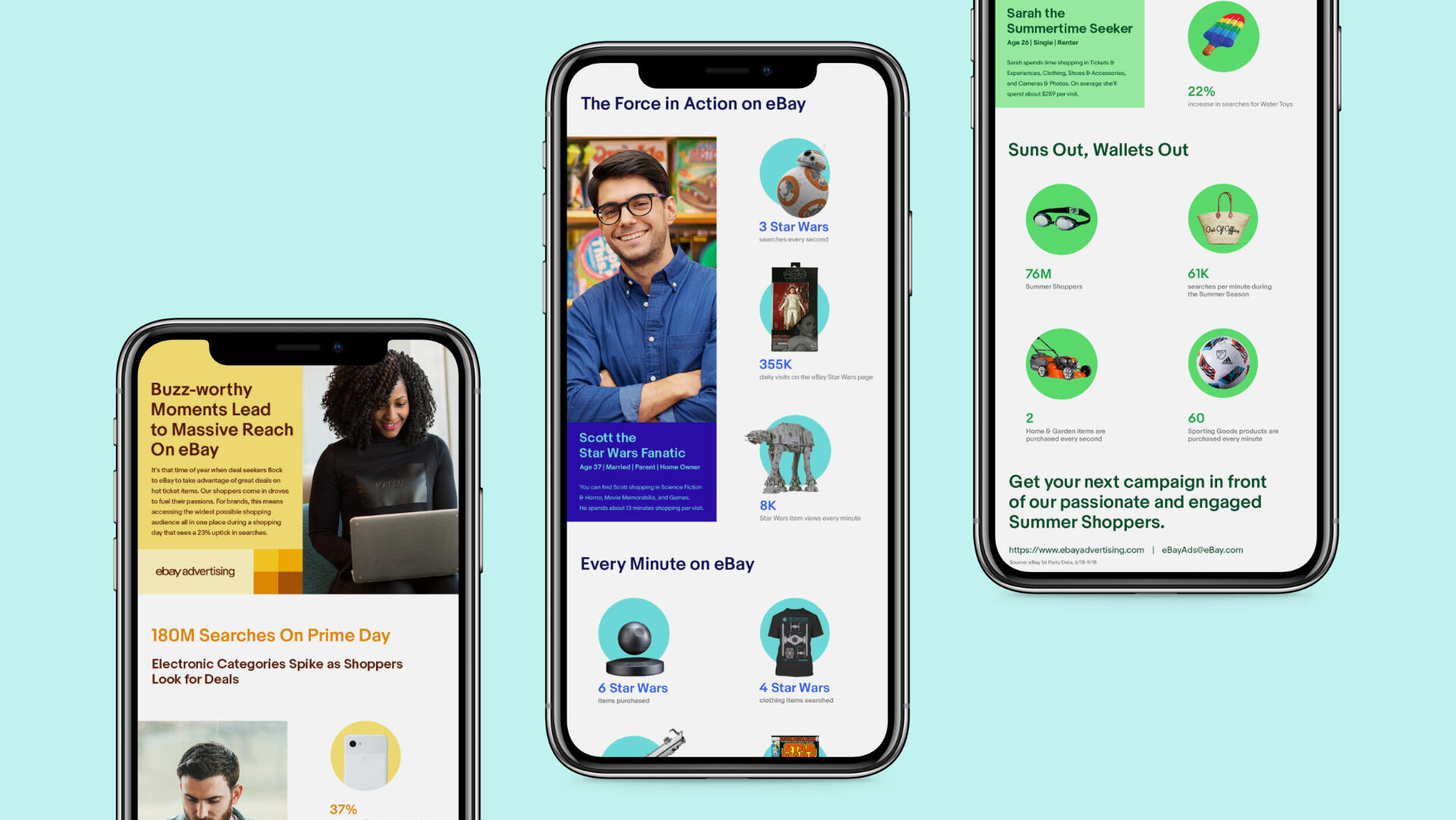
Animated Ads
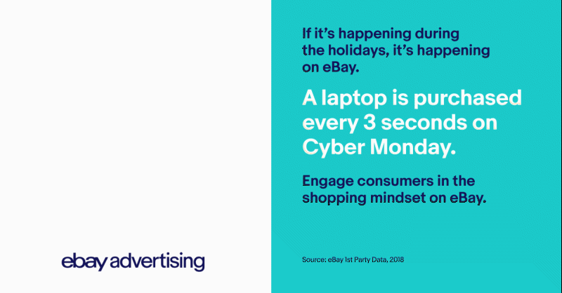
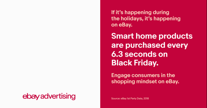
1P In-App Banners
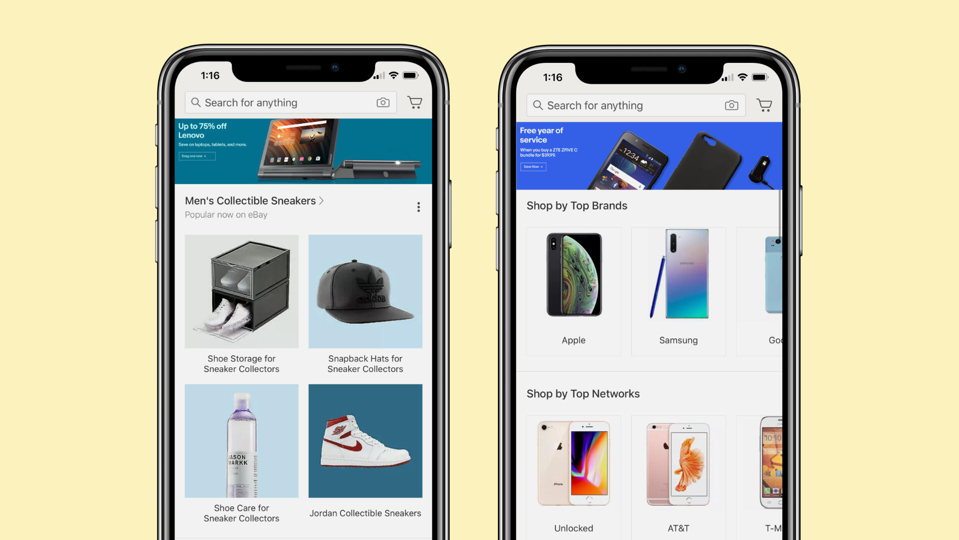
3P In-App Banners
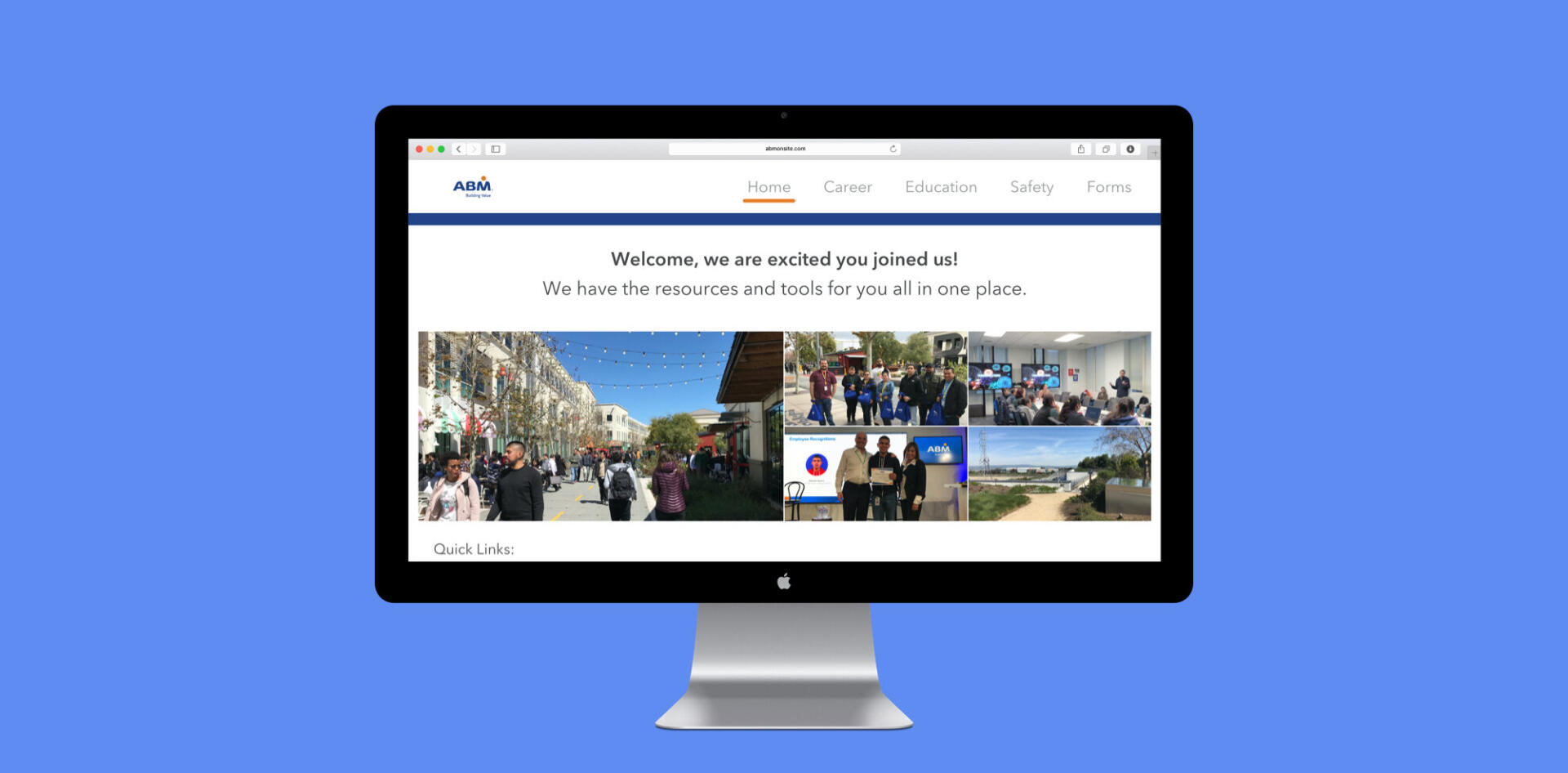
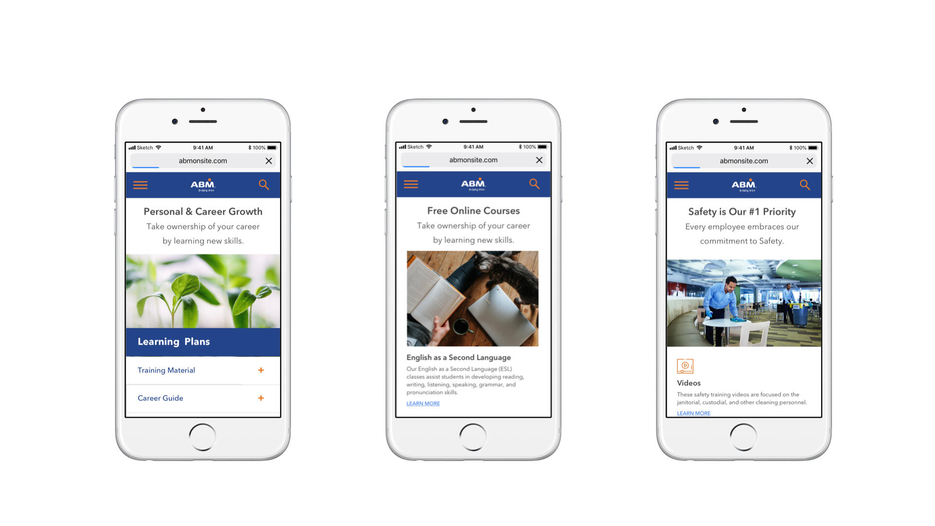
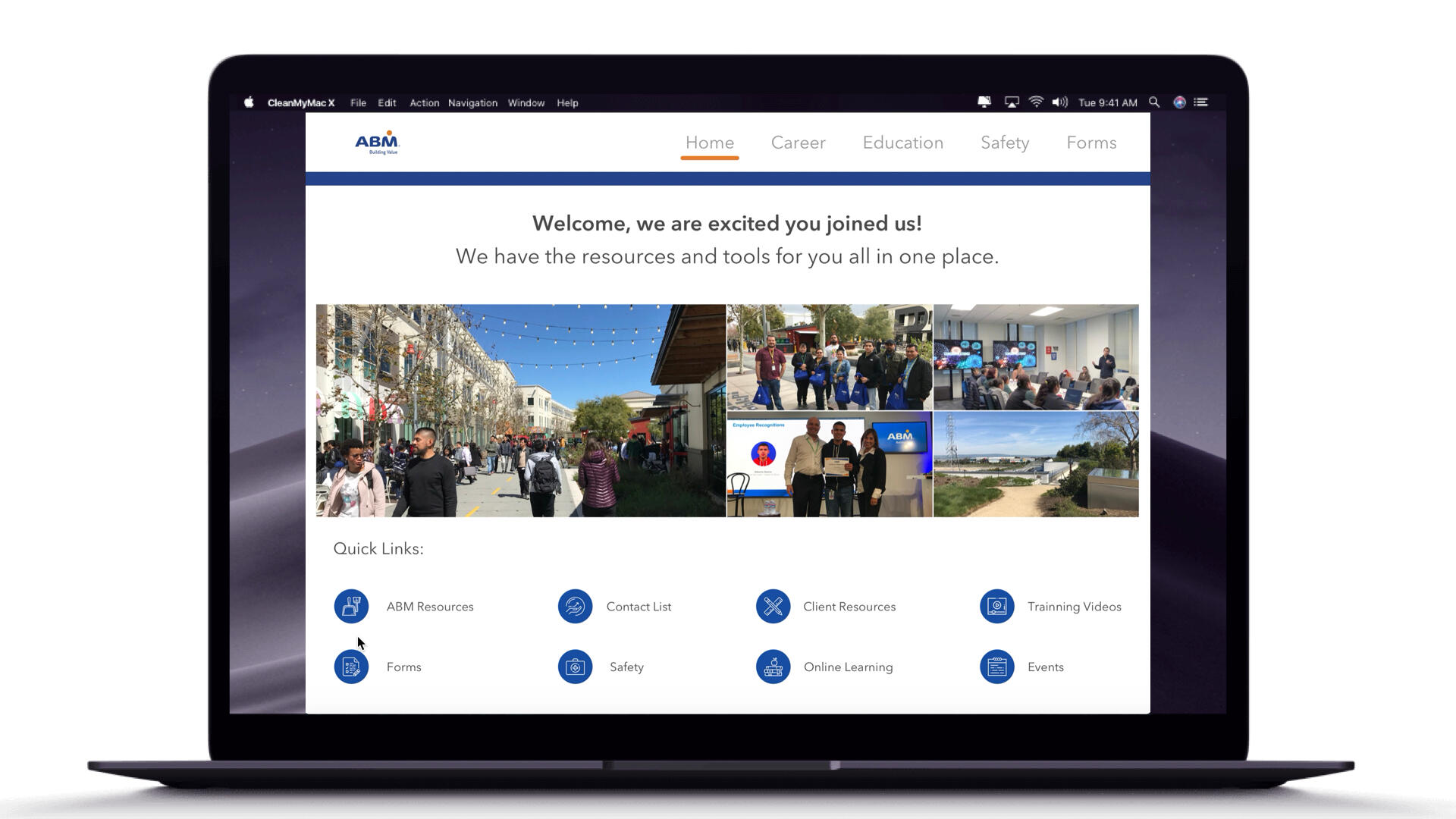
ContextIn 2018, I joined ABM Industries to create a team website for their janitorial staff at Facebook in Menlo Park, CA.The team website was much needed by the janitorial staff and management team to be efficient with communication, collaboration, and work tasks. This website would also enable ABM staffing to onboard a recruiting process to fully staff all Facebook campuses to meet their janitorial and event needs.RoleMy role was to research, ideate, design, user test, and develop the team Website. This project could not have been possible without the feedback and support of ABM operations, talent & development, management, and hourly staff to make this website possible.Tasks & ResponsibilitiesResearch, storyboard, sketch, wireframe, prototype, user test, and develop Team websiteDesign Tools / UX Methods UsedPhotoshop, Illustrator, Sketch, InVision, & User TestingProcess
My team and I conducted a series of design workshops, user studies, product walk-throughs, and countless iterations to:
- Highlight the most common patterns
- Identifying the overlap opportunities
- Define our design principles
- Define design teams' needs
-Define front end-to-end teams' needs
- The system support & communications iterative process


Personas
To empathize with the different types of users, we developed personas based purely on experience and assumptions. These serve as a starting point to reflect on the user's needs and challenges and possible solutions that can be considered later in building the information architecture.
Information ArchitectureTo use information architecture effectively, I first analyze my content and understand my users' needs and behaviors. Then, I create a hierarchical structure, implement metadata and tagging systems for enhanced searchability, and regularly review and refine the IA based on user feedback and evolving content requirements.
UX AuditTo understand the old site and its content, I ran a content audit listing all available information and features. Based on this, my team and I collectively decided what to keep, what to remove, and how content can be integrated into more intuitive information architecture.
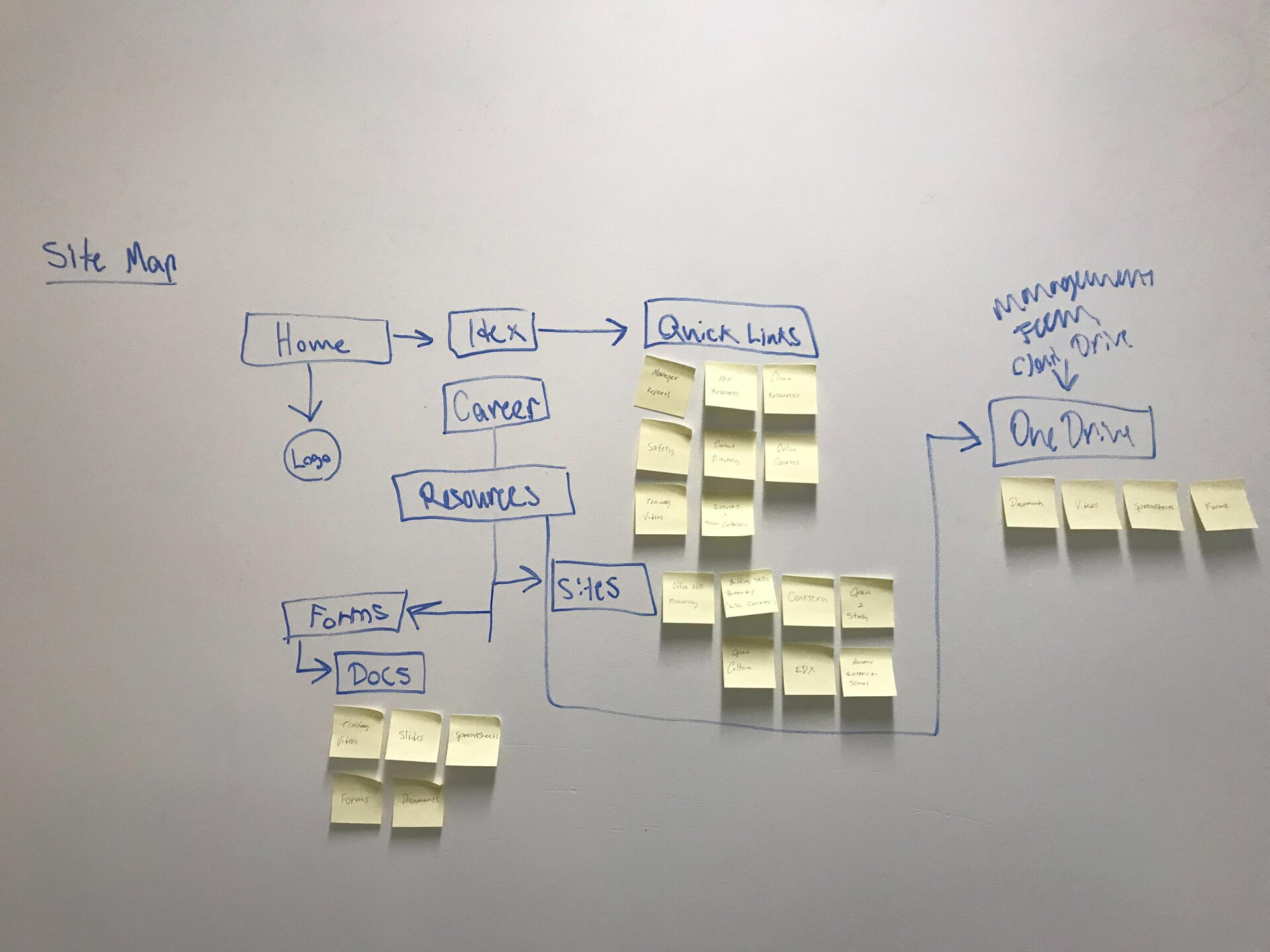
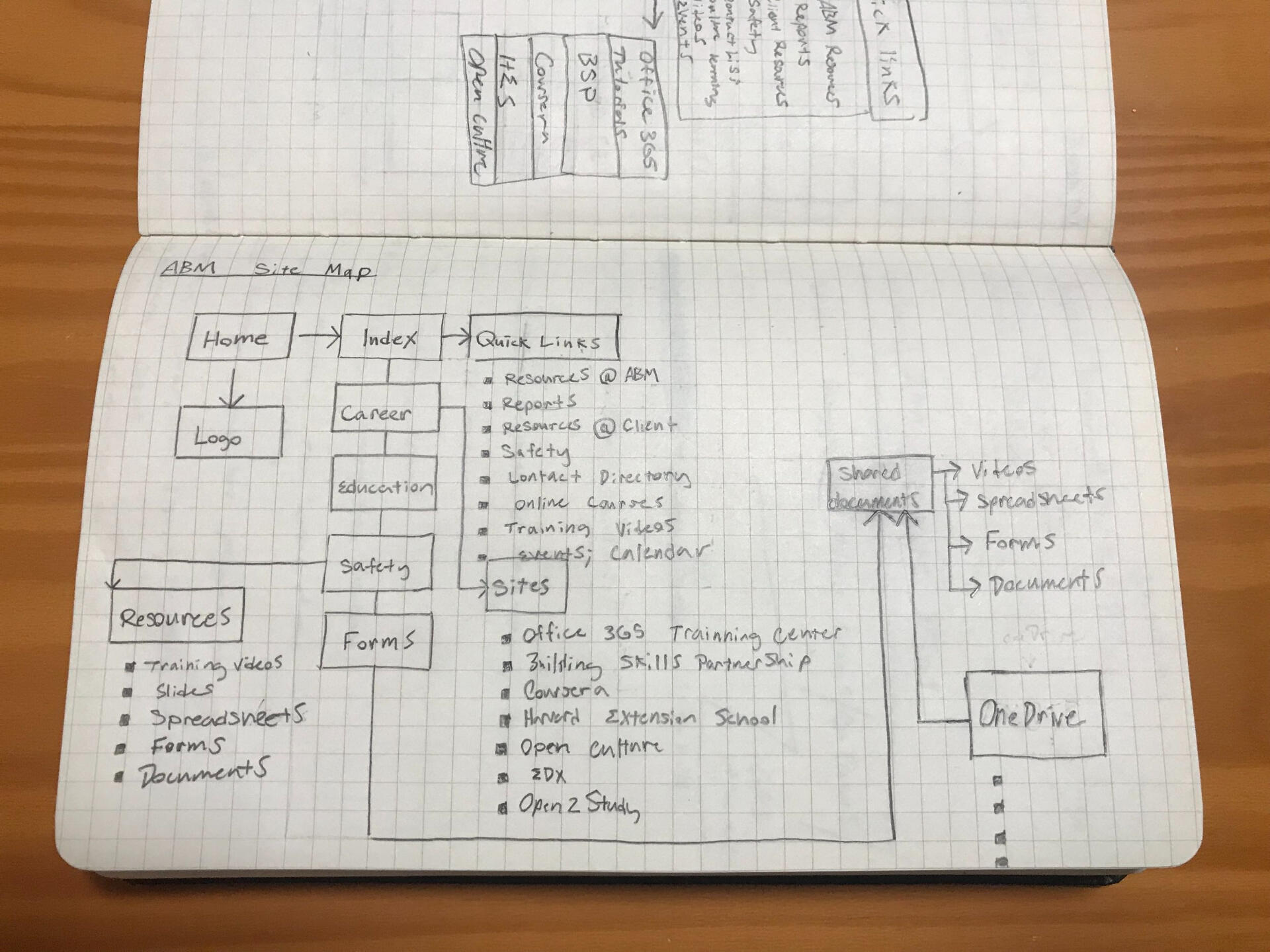
SitemapThe site map enabled me to organize holistically the pages of the website. I also worked with some colleagues to determine where pages would be located on our home menu. Pages were organized by importance and priority to each of the team's needs.


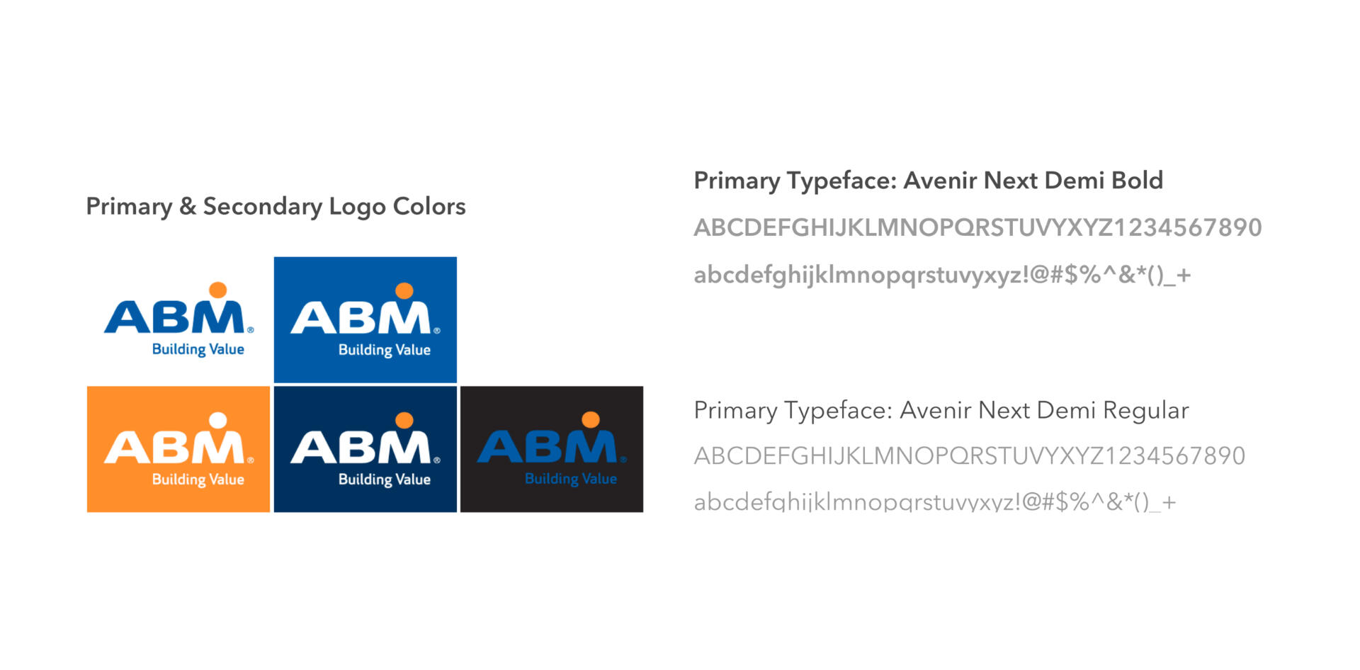
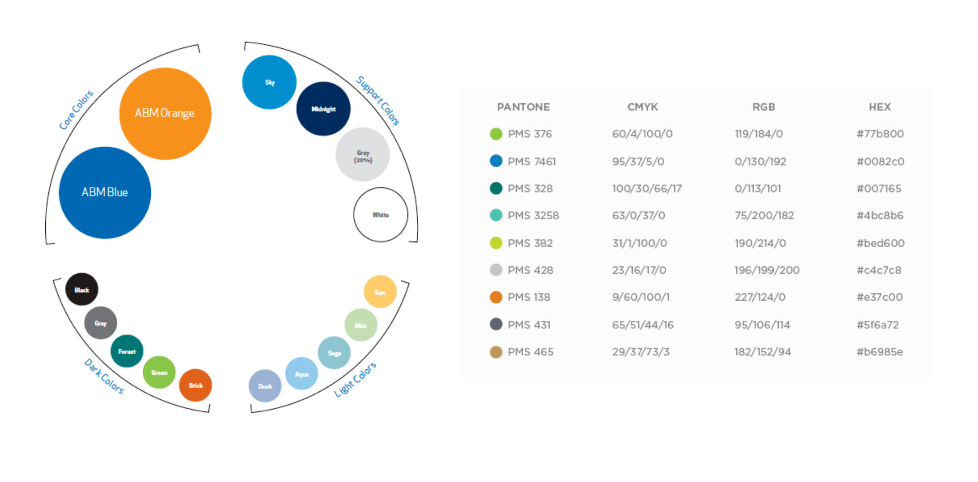
Visual Style Guide
Final Compositions


LearningsI learned that having a diversity of users involved early in designing workflows was effeciive.The project had many challenges; the most difficult part was finding ways to create an ecosystem that has various user journeys all in one place to bring team members together to be more collaborative and efficient to meet their business needs.Results
After creating the website and keeping all digital and available files on the web, our onboarding process time was cut by 65%. We saw a better retention rate and better staff by the 3rd quarter of 2018.
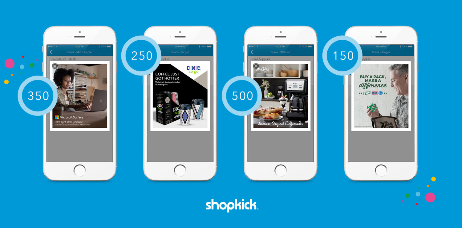
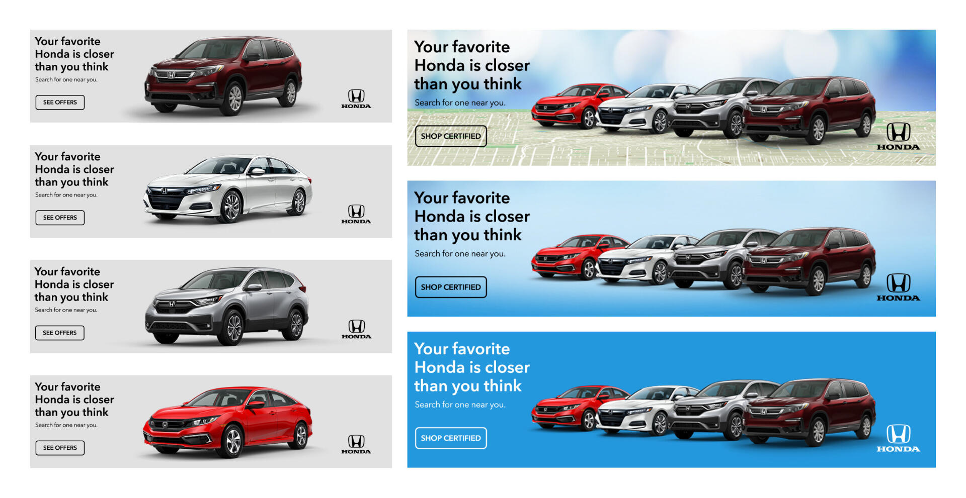
ContextShopkick is an engaging shopping reward app in the United States. The platform connects digital and physical retail with beacon technology and rewards millions of users across the full path to purchase for actions such as walking into stores, scanning products, browsing content, and making purchases in-store and online. As a production designer at Shopkick, I worked with major retailers and brands, creating in-app campaigns that provided exclusive rewards to Shopkick users to increase product in-store and online sales.Tasks & ResponsibilitiesCreate in-app campaigns featured in the Shopkick app for significant brand and retail partners.Design Tools UsedPhotoshop, Illustrator, Sketch, & InDesign
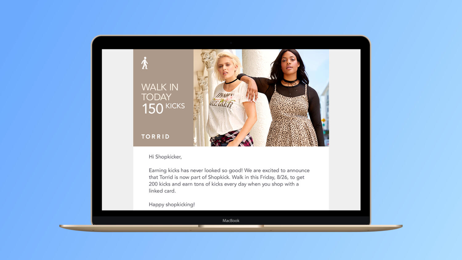
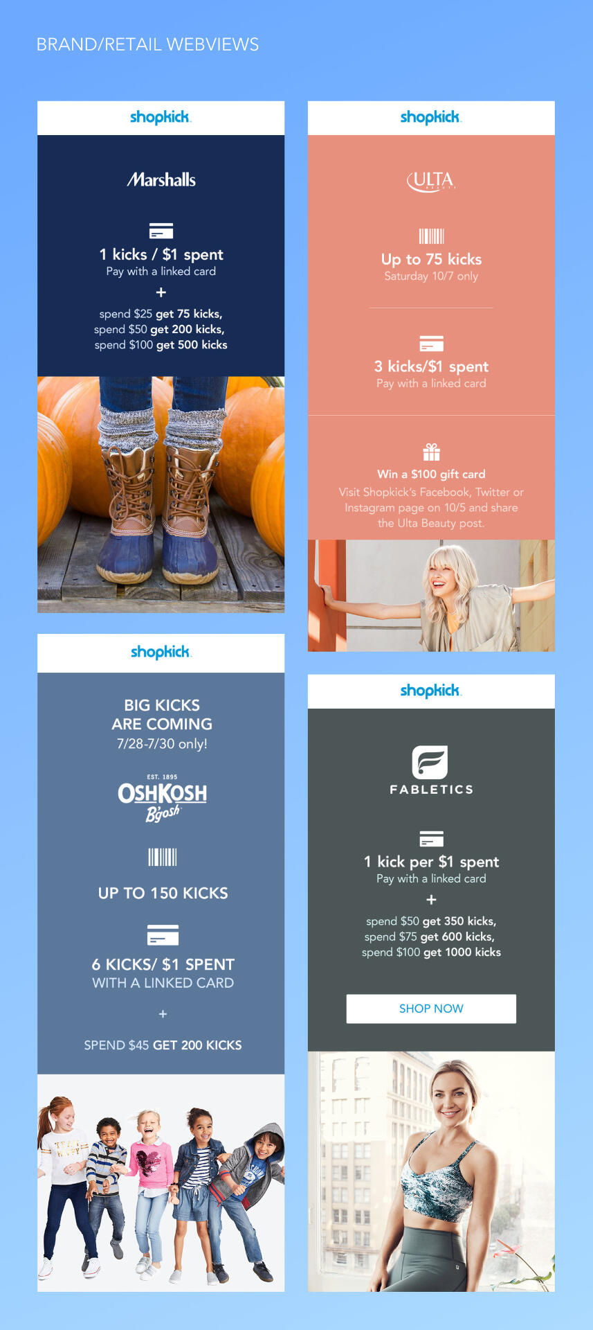
Email AdsBelow is an example of an email banner I created for new partner launches, such as Torrid. These promotions were essential for informing loyal users to continue to visit these retailers and make the most of their shopping.Email banners also help users be engaged in contests as well as a variety of select dates where they can earn more kicks of their in-store engagement.
In-App Promo AdsSome of my work consisted of creating brand and retail lookbooks filled with content such as recipes, nutritional information, as well as insights in regard to product use and benefits. We also included video ads to be displayed in our app for users to be aware of new products as well as earning kicks to redeem gift cards.


In-App Branded LookbooksI also created in-app banners that included offers to encourage users to pick items from the shelf and scan them to redeem kicks. Kicks are available when the user makes a purchase and scans their receipts. Users can also walk to partnered stores and get kicks for stepping into the store to encourage users to view more products available for more offers.
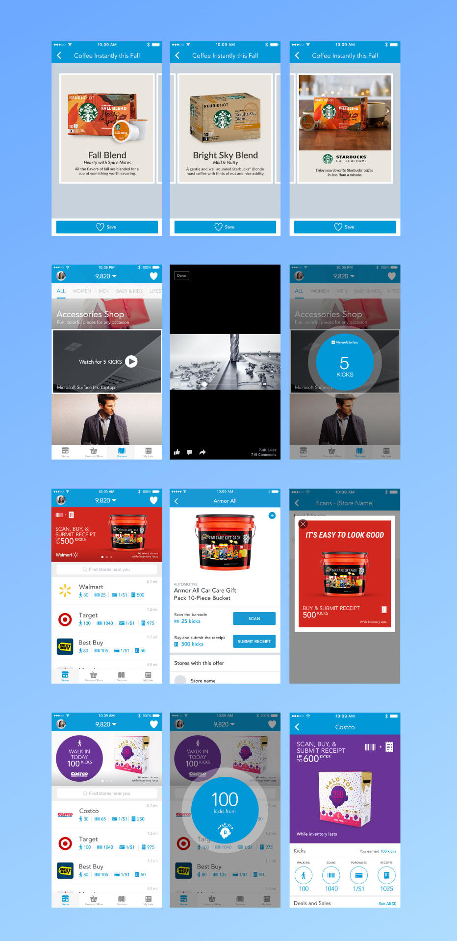
In-App PromotionsAt Shopkick, I created a wide variety of in-app campaigns by which I also included web views. These web views are roadmaps to earning more kicks and making the most of purchases.On special occasions, users could win a lot more based on their shopping expenses. These ads also include dates as well as limited-time offers.
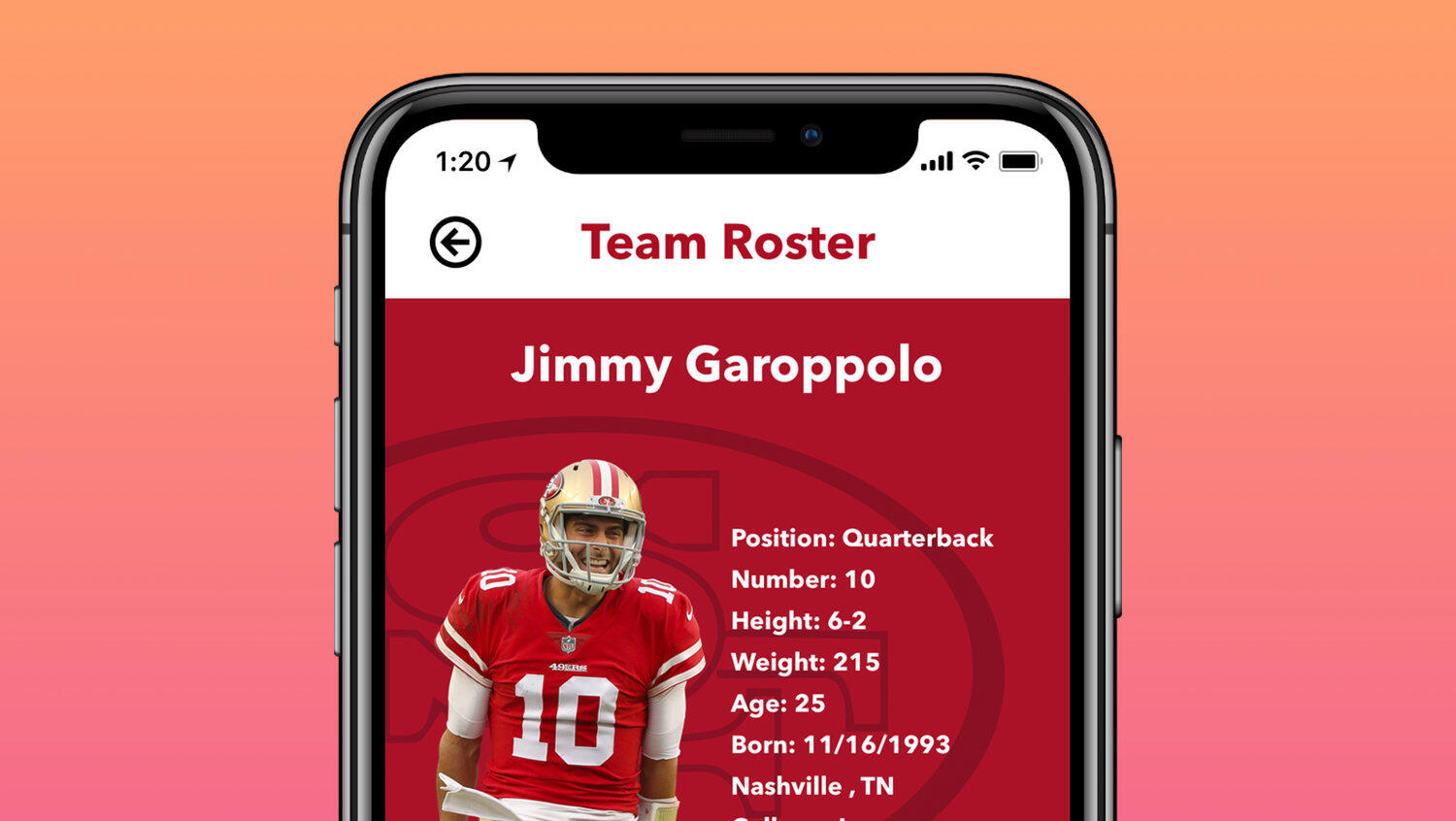
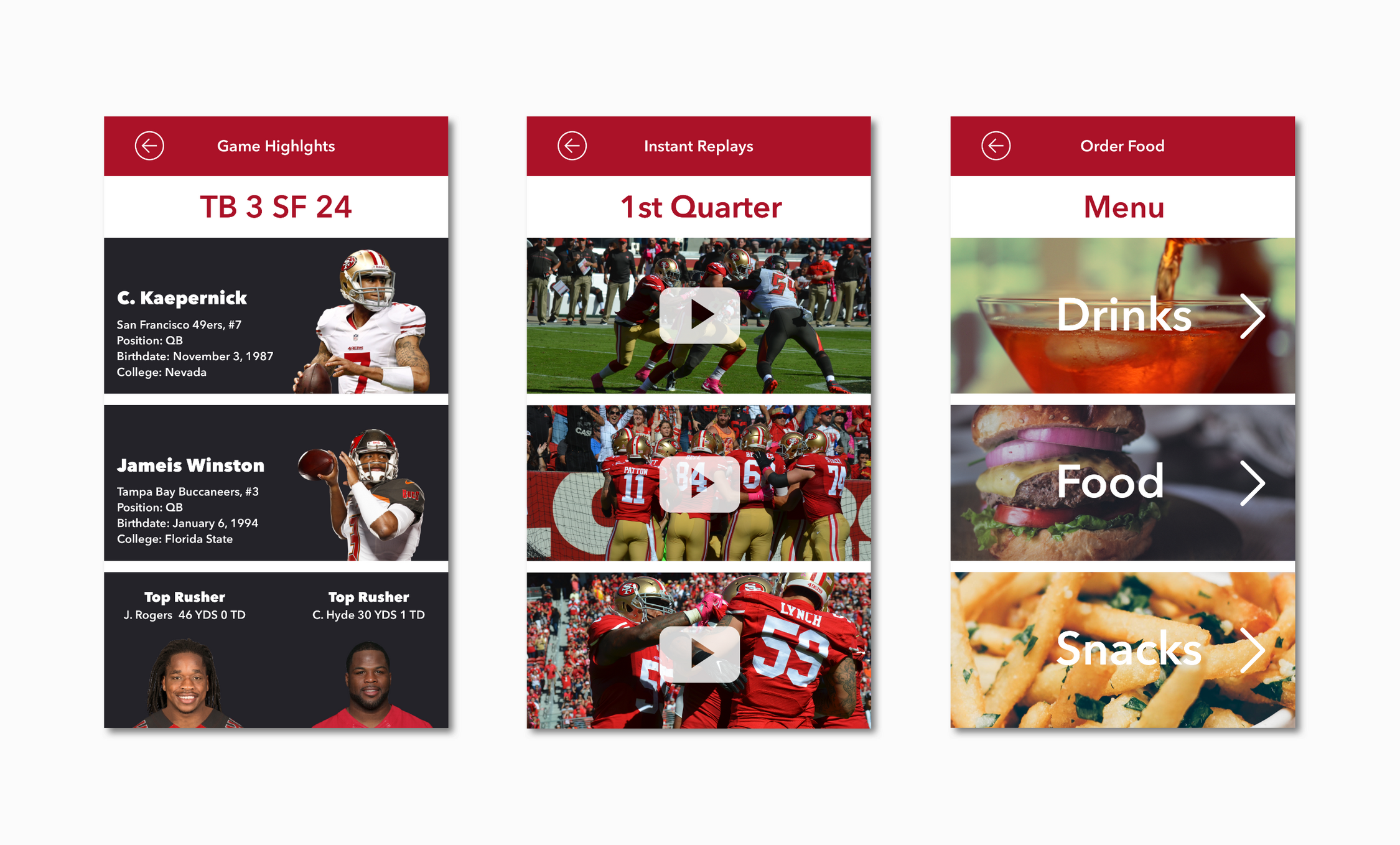
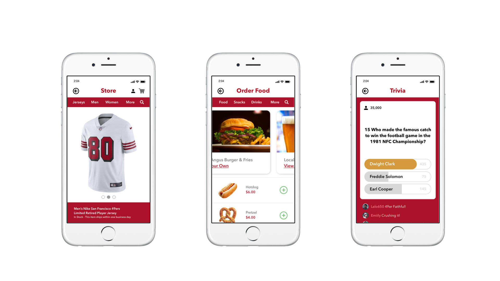
ContextReel Code is an app that allows users to unlock cool features such as ordering food, Making Fan Store Purchases, Fan Trivia, and more. It keeps fans engaged and aware of what Levi’s has to offer all in the palm of your hand. My role was to research, design, and test all user interfaces related to the project. I collaborated with design, product development, and engineering to launch this project.Tasks & ResponsibilitiesDevelop the UI to showcase as a demo to potential investorsDesign Tools / UX Methods UsedSketch, Flinto, InVision, Cardsorting, A/B TestingDesign ProcessOur Product and marketing team researched what technology was available at Levi’s Stadium and other local venues in the Bay Area. We discovered that a lot of time, promotions, and services are not implemented in digital form. Knowing that there is full Wi-Fi coverage around the stadium, there is an opportunity to give attendees a digital experience.Our Product and Engineering team created a digital experience for the San Francisco 49ers by implementing a branded barcode that would be scanned by our Reel Code Media app. Users can unlock four features that could be available for Levi’s attendees. These barcodes would be labeled on every seat at Levi’s Stadium, and users would be able to order food, purchase fan gear, participate in half-time trivia and view quarter-to-quarter game highlights.
PersonasBased on the storyboard, we identified and created two personas to us help us focus on and think holistically to prevent our own desires for features from trumping the user's needs.


WireframesCreating wireframes provided usability to the forefront in showcasing page layouts at their core. It promoted ease of use, conversion paths, naming of links, navigation placement, and feature placement. Wireframes can point out flaws in your site architecture or how a specific feature may work.


Low Fidelity Concepts
Final Compositions

High-Fidelity Prototype
LearningsBased on my user research, I was surprised by how much utility a mobile app can provide users at a sports venue. Users appreciated the ability to have instant experiences such as ordering food and merchandise, participating in trivia, and watching quarterly videos and highlights.Key Performance Indicators (KPIs) such as increased user engagement, higher transaction rates, and improved customer satisfaction underscored the success of these features.I enjoyed going on-site to Levi’s Stadium and seeing where our QR codes would be present for users to scan the custom barcode and engage with our app features. Tracking KPIs such as the number of scans per game and the conversion rate from scans to interactions provided valuable insights into the effectiveness of our on-site implementation strategy.
Results
25K
App Downloads
+72%
Trivia Users
45k
Mobile Orders